top of page


National Geographic Redesign
BRANDING/EDITORIAL DESIGN
2014
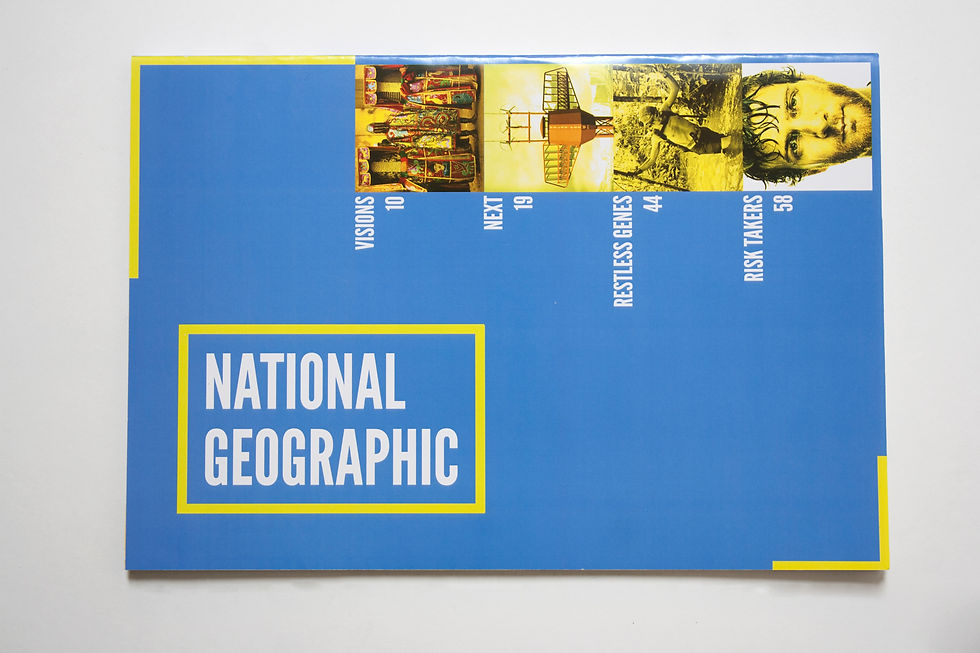
For my rebranding of National Geographic Magazine, I chose to focus on the magazine's reputation for striking photography. I reduced the yellow border, which took up a lot of cover space, to two thin corner brackets, to give more cover space to the exquisite photography of the magazine. In this way, I made reference to the historical design while improving its function. I also simplified the incongruous typography to one clean, sans-serif typeface.
TYPOGRAPHY
League Gothic Regular
bottom of page